Game level design and lighting progress.


Hello every one! How have you been? I have been great! This is Charan talking in case you are wondering!
Two weeks ago I was playing Until Dawn on my PS4. It’s a great horror video game with great visuals and tense game play which revolves around choices. This time around I was analyzing it while I was playing, especially the level design and lighting. You might know that good lighting goes a long way making a game look great. In fact lighting a one of the most important aspects to get right in video games so much that it makes or breaks the visuals of a game. Until Dawn has a lot of corridors and caves to wonder around. I observed some things in those corridors, about its lighting. In those corridors what I noticed was, whenever possible there is a source of natural light. What I mean to say is there is always some opening in the locations which lets moon light in. This opening lets some moon light in and has light shafts. This makes it look great! The natural light steps up the visual appeal of the level. So as soon as I started working the next day, I tried it out.
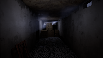
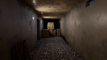
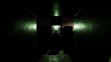
At first the level I am working on had no natural lighting. All the lighting was from Light bulbs and other man made light sources. Which looked ok. So I fired up blender and edited the base mesh of the level to have some openings so it would let some mood light in. Then I created light shafts or god rays as you might know it. I could have added a sun and changed the color and brightness to make it look like moon light but that would lead to some other complications such as having to cover the outside of all the level meshes otherwise moon light would come through ceilings and walls because the level mesh is one sided and I don't have time to edit the level mesh and make it all have thickness. I might do it someday though. So I use spot lights. Placed them inside each of the openings to cast light on the opposite wall. But the look I got was not satisfying. So I added point light to fake the light dispersion of light. This proved better and also nullified the need of the spot lights. So I removed the spot lights and the result is good. This is one corridor. Now it looks better, more interesting and gloomy. Coming days I'll be experimenting with natural light whenever possible and I believe it makes the game look way better than before. You can check out the images attached to see the difference.
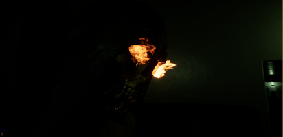
Also This week I started working on a boss encounter in our game. I will tease just a bit of him with an image.
What do you think? Leave your thoughts in comments
You can tell us what you think in our discord channel, join our discord channel here!
https://discord.gg/TA5YtDG
Follow our Facebook page to stay tuned!
https://www.facebook.com/madhatgamestudios/
Get Rebirth
Rebirth
This is just a demo version of our current project.
| Status | Prototype |
| Author | madhatgamestudios |
| Tags | First-Person, Horror |
More posts
- Switch to vertex painting!Jan 05, 2019
- Post Processing is the man!Nov 24, 2018
- Another small update after 14 days!Nov 17, 2018
- Just a an update of what's happening this weekNov 03, 2018
- Quality vs performance of the game.Oct 20, 2018
- Weekly update on our game RebirthOct 06, 2018
- Shooting and stuffSep 22, 2018
- Detailing the levelsSep 08, 2018
- Just Coding And Other StuffSep 01, 2018

Leave a comment
Log in with itch.io to leave a comment.